12 Essential Terms: the Basics of UX Design Language

To understand UX design language, you have to really know your goals, your clients, and be able to communicate effectively on a team. As you get started with User Experience (UX) and User Interface (UI) design, it requires understanding of a whole new language, composed of many simple concepts but full of nuance and complexity once these simple concepts are combined together.
User Experience is often a “living design”, where it can continue to evolve and change as designers work to create desirable experiences for their clients.

As the science behind User Experience continues to grow, so has the language we all use to speak fluently within this complex field. Working with Brian Wilke, Senior Engineer at HP, we have put together an essential beginner’s list of UX Design Language.
Here are some common terms you need to know to communicate effectively within the UX design world:
User experience (UX) design is the process of creating products that provide meaningful and relevant experiences to users.
Products can be a software app, web site, or other digital deliverable. There may be several features within a product. Or the product may be very focused on what it delivers in functionality.
User Interface (UI) design is the consideration of how an application, or web site is used by the audience. It takes into account color, typography and other branding elements.
Interaction (IX) design considers what happens when a user takes action on a page, site or app. It is aware of context, limitations and patterns of behavior.
User is the most important part of the design process. A user is defined as the target audience of the design effort. They may be represented by a persona in order to better understand their needs.
Persona is an imaginary, though rooted in reality and research personality that reflects who we are designing for. This personality may have aspects from several consumer segments, but generally the more focused the better.

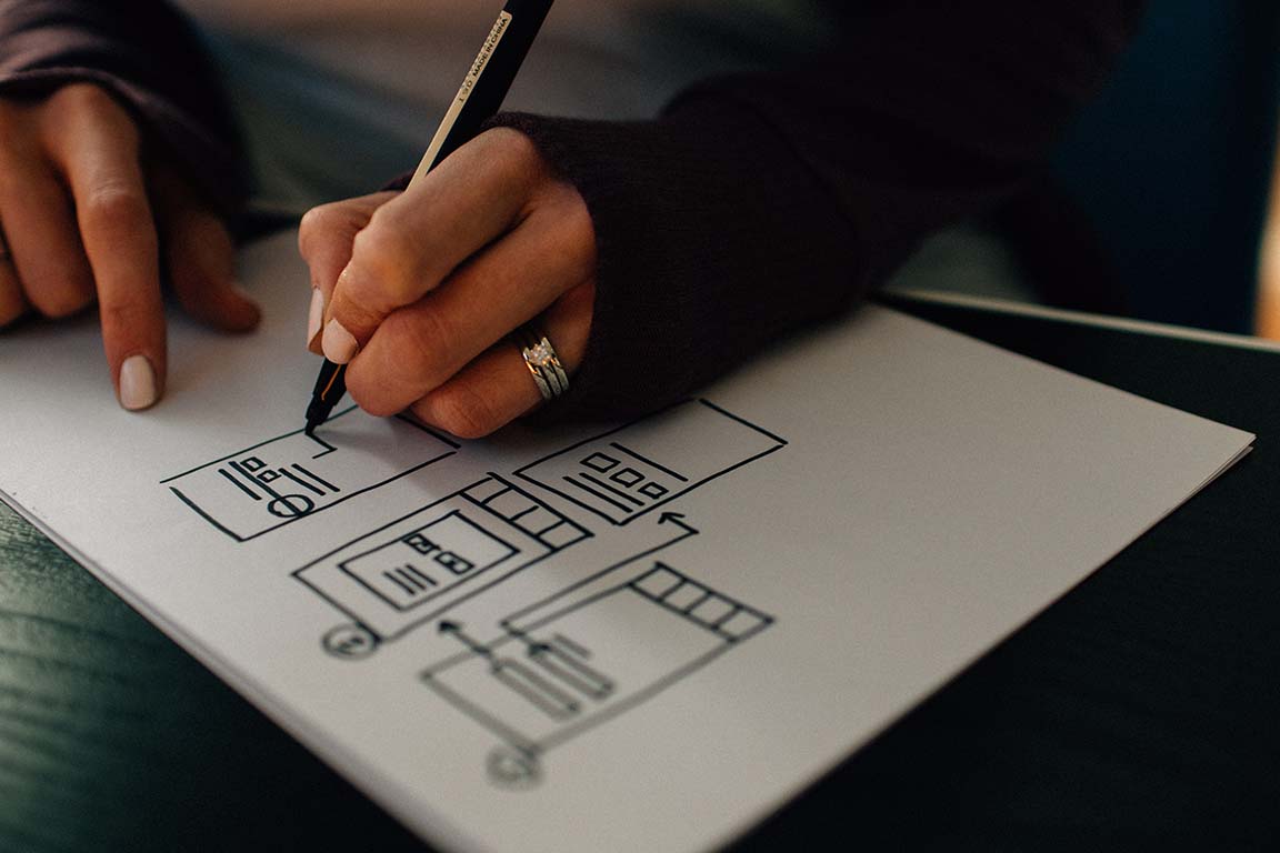
Wireframe is a low fidelity representation of what will be on the page within the user’s experience. This is NOT a mockup, nor a prototype. It is a way to start organizing what content (images and text) and navigation is available in a view.
Prototype is usually a working model for how the finished product will work and look. Sometimes as part of UX, we use paper prototypes when a piece of software is either not available or there are confidentiality concerns.
Mockup is a higher resolution version of the wireframe, and will likely portray the correct layout and images to be used in the finished product.
A-B Test is used in research to see if alternative flows, styles, or content is more successful in allowing the user to achieve the desired goal.
Responsive Design is now common practice that allows the product (app or site) to respond to the viewport it is being experienced within. This may include scaling or repositioning content to be easier to interact with.
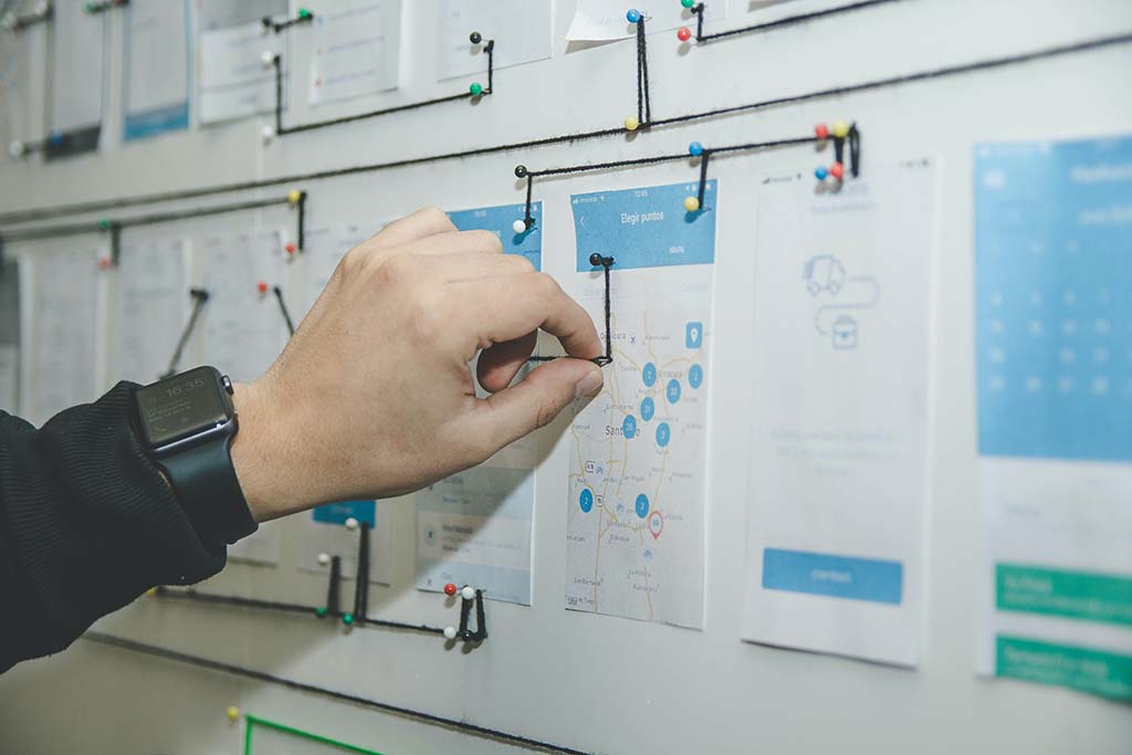
Flow is created to show the path (“happy” or error) that a user is presented with. This may also be reflected in a User task or User journey.

Get Started with a UX Design Career
This year, DWC will be unveiling our new UX Design certification program that will encompass these essential terms, as well as so much more. The program includes many deep dives into the world of User Experience, as well as essential technology such as Adobe XD, Adobe Photoshop, and Figma.
Working closely with UX experts, we have designed a unique program that provides experiential learning in a hands-on, classroom environment and available online to anyone. The class will challenge our students to build a portfolio of UX designs as they begin a job search in this fast-growing field.
To learn more about the upcoming UX design certification or any of our other design certifications, contact us to speak to a student advisor.
